
Photographers Rarely Stumble Into Balance Without Planning It First
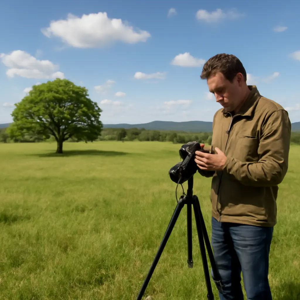
Photographic balance is the deliberate distribution of visual weight across a frame so that its elements feel composed rather than accidentally lopsided. Photographers rarely achieve it by chance: they plan where subjects, highlights, shadows, colors, and empty space will sit, then refine the arrangement through framing and editing. This matters because balance affects how quickly viewers understand an image and where their attention travels. The discussion below explains visual weight, composition tools, practical planning methods, and examples—while distinguishing intentional imbalance from a composition that simply feels unresolved.
Photographic balance depends on planned visual weight
In photography, visual balance is the perceived equilibrium among elements in a frame. It does not require identical objects on each side of the image. Instead, photographers judge how factors such as size, contrast, color, sharpness, position, and subject meaning combine to attract attention. The idea is related to balance in visual art, where unequal forms can still feel stable if their perceived weight is distributed thoughtfully.
There is no universal numeric score for photographic balance: perception varies with subject, culture, viewing size, and intent. The practical test is whether the arrangement supports the image’s purpose. A portrait may feel balanced when a face is offset by negative space, while a dramatic landscape may deliberately feel unstable to suggest tension. Balance is therefore a compositional decision, not a rule that every photograph must appear symmetrical.
Visual weight: the elements that attract the eye
Visual weight is the relative attention an element commands. A large, bright, sharply focused subject often attracts more attention than a small, dim, soft-edged one. A face, a vivid color, a strong geometric shape, or a high-contrast edge can also carry substantial weight. These are tendencies rather than fixed laws: context can make a small detail—such as a distant person beneath a vast sky—the most meaningful part of a frame.
Photographers can use a simple field check: identify the first thing the eye sees, then ask whether the remaining elements support, counterbalance, or distract from it. Reviewing a frame as a thumbnail or in grayscale can reveal whether a bright corner or dark mass is pulling attention away from the intended subject.
Balance is not the same as symmetry
Symmetrical balance places similar shapes or visual weights around an axis, often producing order and formality. Asymmetrical balance uses different elements to create an approximate equilibrium—for example, a person on one side of a frame balanced by a bright window or open landscape on the other. Radial balance organizes elements around a central point, as in a spiral staircase photographed from above.
These categories are useful ways to describe composition, not a ranking of better and worse approaches. Symmetry can emphasize architecture or stillness; asymmetry can suggest movement or natural complexity; and a deliberately unbalanced frame can communicate urgency or isolation.
Composition tools help photographers plan balance
Once photographers recognize visual weight, they can choose framing tools that guide its distribution. The rule of thirds, leading lines, framing, and negative space are not guarantees of balance. They are practical aids for placing subjects and organizing relationships within the rectangle.
Rule of thirds and deliberate subject placement
The rule of thirds divides a frame into a three-by-three grid and suggests placing important subjects near its lines or intersections. It can help a photographer leave room in the direction a person is looking or a vehicle is moving. But placing a subject off-center does not automatically make the image balanced: the opposite side may need a counterweight, such as a secondary subject, a contrasting shape, or a more carefully controlled area of empty space.
For example, in a landscape, a tree placed near one vertical third may be balanced by a bright cloud or a distant ridge elsewhere in the frame. The grid is a starting point; the photographer still has to assess the relative scale, contrast, and meaning of those elements.
Negative space, framing, and leading lines
Negative space is the relatively open area around or between subjects. It can balance a visually strong subject, clarify its outline, and give the viewer room to imagine movement or direction. Framing—using elements such as a doorway, branches, or an arch around the subject—can concentrate attention, though a heavy or bright frame may itself become a competing visual weight.
Leading lines, including roads, fences, shorelines, and architectural edges, guide the eye through the composition. Their direction matters: a line can connect a counterweight to the subject or lead attention out of the frame. Before pressing the shutter, photographers can check whether the lines reinforce the intended viewing path rather than dividing the image awkwardly.
Planning a balanced photograph starts before the shutter
Planning does not mean scripting every detail. It means noticing what the scene contains, deciding what the photograph should communicate, and making purposeful choices about viewpoint and timing. For landscape, portrait, product, and documentary work alike, a brief composition check can prevent an important subject from being crowded, obscured, or overwhelmed by its surroundings.
A practical pre-shot composition check
- Identify the intended subject and the emotion or information the image should convey.
- Scan the frame edges for bright objects, cut-off forms, and distracting lines.
- Compare the subject’s visual weight with other elements, including highlights and dark areas.
- Choose a framing approach—symmetrical, asymmetrical, or intentionally unsettled—and test a few viewpoints.
- Review the image at a small size, then adjust position, focal length, exposure, or timing if attention is drifting.
The sequence is especially useful in changing light. A cloud, reflection, or passing person can quickly shift the frame’s visual weight, so photographers may need to recheck composition after exposure or focus adjustments.
Examples across genres
In portrait photography, an off-center face may be balanced by looking room—the space in front of the subject’s gaze—or by a simple background on the opposite side. In product photography, the object can be balanced with a controlled shadow or a small supporting prop, while keeping the product visually dominant. In documentary work, a photographer might place a person at the edge of the frame and use architecture or empty space to express vulnerability or scale.
Landscape photographers often balance foreground, middle distance, and sky rather than treating left and right halves as equal. A dark foreground rock can counter a bright area of sky, while a small human figure can provide scale without outweighing the landscape. In each case, the example illustrates a choice about visual relationships, not a formula that guarantees a successful image.
Editing can refine balance without replacing composition
Post-processing can adjust tonal contrast, color intensity, cropping, and local emphasis. Cropping may remove a distracting edge or redistribute space around a subject; subtle dodging and burning can guide attention; and color adjustments can reduce a competing accent. These changes are most effective when they strengthen an already considered composition rather than trying to rescue a frame whose central relationships do not work.
Check the image at different scales and in grayscale
A photograph viewed large may reveal detail, but a thumbnail often makes the hierarchy of shapes and tones easier to judge. A grayscale preview can show whether tonal contrast is creating an unintended imbalance, even when color initially seems harmonious. Photographers should also check that a crop does not leave an awkward sliver of an object or compress the space in the direction a subject is moving.
Editing choices should serve the photograph’s purpose. A fashion image may benefit from polished symmetry, while a news photograph should preserve context and avoid manipulations that misrepresent the scene. The ethical limits depend on the genre and publication standards, but the compositional principle remains: make the intended visual relationship clear without misleading the viewer.
Conclusion: balance is a decision, not a lucky accident
Photographic balance comes from understanding visual weight and choosing how to distribute it. Symmetry, asymmetry, negative space, leading lines, and subject placement give photographers different ways to establish order, movement, or tension. A quick pre-shot scan and a thoughtful editing review can help ensure that the viewer’s attention lands where the photographer intends.
Try making two versions of your next scene: one conventionally balanced and one deliberately uneven. Compare how each changes the mood and viewing path. That exercise turns balance from an abstract compositional term into a repeatable creative choice.
Sources: National Gallery of Art, “Principles of Design,” https://www.nga.gov/educational-resources/teaching-packets/principles-design; Tate, “Composition,” https://www.tate.org.uk/art/art-terms/c/composition; Encyclopaedia Britannica, “Visual Arts: Elements of Design,” https://www.britannica.com/art/visual-arts/Elements-of-design
Related Post

Constructed Image Making Explained A Beginner Guide to Staged and Conceptual Photography
Constructed Image Making and Its Definition in Staged and Conceptual Photography Constructed Image Making refers [...]
Stripping Away Color Changes How You See Everything
Stripping away color changes how people interpret images, but it does not simply make vision [...]