Common Mistakes New Digital Artists Make With Their Software
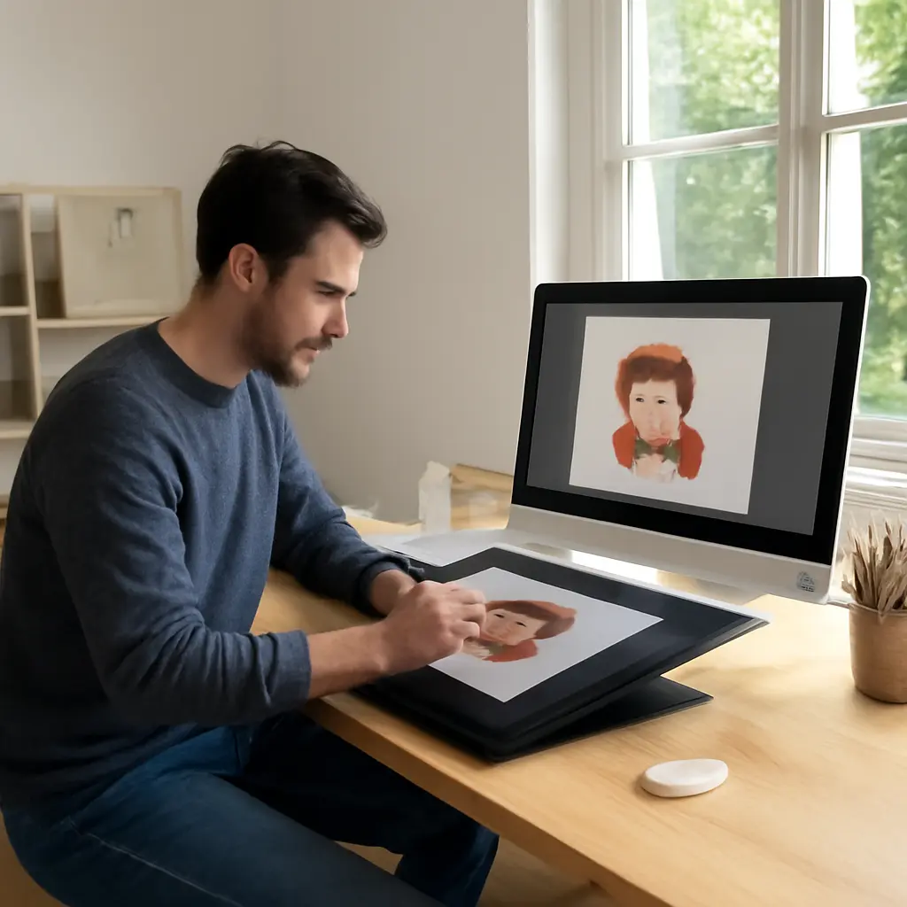
Digital art software is the collection of applications and tools artists use to create, edit, organize, and export visual work. New artists often struggle less with a lack of talent than with avoidable workflow mistakes: using the wrong document settings, relying on one undo-friendly file, overcomplicating layers, or exporting in a format that changes the finished image. Understanding these common errors—and the practical fixes—helps artists work more confidently across raster, vector, and 3D tools. It also matters in a field where digital production is widespread: the U.S. Bureau of Labor Statistics reports that 62% of special effects artists and animators were self-employed in 2023, making reliable, repeatable workflows especially valuable.
Software Workflow Mistakes: Choosing the Wrong Setup
A software workflow is the sequence of settings and actions used to create and deliver an artwork. Adobe’s digital-imaging guidance distinguishes image properties such as pixel dimensions, resolution, color mode, and file format because each affects how an image looks or behaves in a particular output. For beginners, the key lesson is to match the document setup to the intended use before investing hours in the artwork.
Starting With the Wrong Canvas Size or Resolution
Canvas size describes an image’s pixel dimensions or physical dimensions; resolution describes how densely those pixels are assigned when preparing print output. A small canvas enlarged later can look blurry because the software must interpolate pixels that were not captured in the original. Conversely, an unnecessarily huge document can slow brushes, transforms, and autosaves.
For a screen illustration, artists should generally plan around the intended display dimensions and avoid treating a high “DPI” setting as a substitute for adequate pixel dimensions. For print, confirm the printer or publisher’s requirements before drawing. Adobe Photoshop documentation notes that resampling changes pixel data, while changing print dimensions without resampling changes the relationship between pixel dimensions and physical size. A useful habit is to create a template for common destinations—such as social posts, portfolio images, or print pages—and test it with a small draft.
Ignoring Color Modes and Color Profiles
A color mode determines how an image represents color, while a color profile describes how a device or color space interprets those values. New artists may work in RGB for a print job that requires CMYK, or convert a file at the last minute and be surprised when saturated colors become duller. RGB is common for screens; CMYK is commonly used in print workflows, although the exact requirements depend on the production provider.
The International Color Consortium explains that color management uses profiles to help translate color between devices. This does not guarantee identical appearance on every screen or printer, but it makes conversion more controlled. Keep the working profile embedded when saving or exporting where supported, and request a proof or printer-specific profile for important print work. For instance, a neon-looking digital blue may fall outside the printable gamut and require adjustment before a physical poster can reproduce it faithfully.
Choosing Software Without Matching It to the Task
Raster software edits images as pixels; vector software builds artwork from mathematically defined paths and shapes; 3D software creates objects, materials, lighting, and rendered scenes. These categories overlap, but they are not interchangeable in every situation. Painting a textured portrait is usually convenient in a raster application, while a logo that must scale cleanly across a business card and a billboard is often better built as vector artwork.
The mistake is not choosing a particular brand; it is choosing a tool before defining the deliverable. Before starting, ask whether the artwork needs editable paths, pixel-level texture, animation, 3D depth, or a specific export format. A small test project can reveal whether the application’s brushes, shortcuts, and file handling suit the task before the artist commits to a large piece.
File Management Mistakes: Protecting Editable Artwork
File management is the way an artist names, saves, versions, and backs up project files. The Library of Congress’s digital-preservation guidance emphasizes that keeping multiple copies in different locations helps protect digital materials from loss. For artists, sound file habits preserve not only the final image but also the layers, paths, masks, and other decisions needed for revision.
Flattening or Overwriting the Only Working File
A layered project file preserves separate elements, while a flattened image combines them into a single image layer. Flattening can be useful for delivery, but flattening the only copy removes flexibility: text may no longer be editable, a color adjustment may affect the whole image, and a client revision may require rebuilding parts of the artwork.
Keep a native, editable project file and export a separate flattened copy for sharing. Use versioned names such as “poster_rough,” “poster_color,” and “poster_final_02,” or use version history where the application provides it. This is particularly helpful when a client requests changes after approving an earlier draft, or when an artist wants to compare a revised composition with the original.
Using Layers Without a Clear Structure
Layers are independent image or object components stacked to organize an artwork. They enable non-destructive changes, but a file with dozens of unnamed layers can become difficult to navigate. A beginner might leave every sketch mark, paint pass, and adjustment layer labeled “Layer 12,” then spend time hunting for the element that needs editing.
Group related elements and use descriptive names such as “Line art,” “Character colors,” “Background,” and “Lighting.” Separate elements that are likely to change independently, but avoid making a new layer for every minor brush stroke. The best structure is the simplest one that supports likely revisions. In vector work, similarly group related paths and name important objects; in 3D, use clear object and material names so a scene remains understandable as it grows.
Relying on Undo Instead of Saving Versions
Undo reverses recent actions, but it is not a dependable substitute for saving. The undo history may be limited, cleared when a program closes, or disrupted by a crash. If an artist experiments with a major composition change and later decides the earlier version worked better, undo may no longer reach that point.
Save at meaningful milestones—after the sketch, composition approval, major color pass, and final polish—and use autosave as an additional safety net rather than the only copy. The Federal Emergency Management Agency’s general preparedness guidance recommends keeping important records protected and accessible; for digital art, that principle translates into maintaining copies on separate storage or a reputable cloud service. A practical rule is to keep the active file, a backup copy, and an exported preview.
Editing Mistakes: Working Against the Software
Editing mistakes occur when an artist makes changes in a way that is difficult to revise or that damages image information. Non-destructive editing—using adjustment layers, masks, smart objects, or equivalent features—preserves the original content while allowing changes to be modified or removed. Adobe’s Photoshop guidance describes adjustment layers as a way to apply tonal and color changes without permanently altering the underlying image pixels.
Making Permanent Changes Too Early
A destructive edit permanently changes the affected pixels or paths; a non-destructive edit keeps the original material available. Beginners often erase parts of a sketch, paint directly over a background, or repeatedly apply filters to the same layer. Each action can reduce options, especially if the artist later needs to change the silhouette, restore a detail, or adjust the color treatment.
Use layer masks to hide and reveal pixels without deleting them, adjustment layers for reversible tonal changes, and duplicate layers before risky transformations. In vector applications, preserve the original shape before expanding or rasterizing it. In 3D tools, keep an editable source mesh or duplicate before applying irreversible operations. These practices may add a little organization at the start but usually save time during revisions.
Overusing Filters, Brushes, and Effects
Effects and custom brushes can speed up exploration, but applying them indiscriminately can make an image visually noisy or obscure its focal point. A heavy texture over every surface, for example, may flatten the distinction between foreground and background. A blur used to disguise uncertain drawing can weaken edges that should remain crisp.
Treat effects as tools for a specific visual purpose. Test a brush on a separate layer, reduce opacity when appropriate, and compare the artwork with the effect temporarily hidden. The National Gallery of Art’s educational materials on visual analysis encourage attention to how elements such as line, color, and texture contribute to an artwork’s meaning; software effects are most effective when they support those choices rather than replace them.
Working at an Unhelpful Zoom Level
Zoom level changes how much of the canvas is visible, which can affect judgment. At extreme magnification, artists may polish tiny details that disappear at normal viewing size; at a very small zoom, they may miss jagged edges or awkward transitions. This is especially common when painting line art or preparing work for a specific screen size.
Alternate between a close view for edge work, a working view for local painting, and a fit-to-screen view for composition. Periodically mirror or rotate the canvas if the software supports it; a flipped view can make familiar drawing errors easier to notice. For final checks, inspect the artwork at the approximate size at which viewers will encounter it.
Export Mistakes: Delivering the Wrong Final Image
Exporting converts or saves artwork into a format suited to sharing, display, printing, or further editing. The correct choice depends on how the image will be used. The Library of Congress’s format-sustainability resources discuss characteristics such as transparency, compression, and long-term accessibility, while Adobe’s format guidance distinguishes common formats such as JPEG, PNG, and TIFF by their capabilities.
Using the Wrong File Format
JPEG is widely used for photographs and web images but uses lossy compression and does not preserve transparency. PNG supports lossless compression and transparency, making it useful for interface graphics, icons, and artwork with a transparent background. TIFF is often used in professional image and print workflows, while a native project format is usually best for preserving editable layers or objects.
Do not assume one format is ideal for every purpose. Export a JPEG when a compact, broadly compatible image is needed; use PNG when transparency or crisp flat graphics matter; retain the application’s native format for future editing. Always check the recipient’s specifications, because a printer, game studio, or web platform may require a particular color mode, dimensions, or file type.
Forgetting Transparency, Cropping, or Export Dimensions
An export can differ from the canvas preview if transparency is flattened against a background, the artwork is cropped, or the output is resized. A character sprite exported with an opaque white background may be unusable in a game interface, while a social image exported at the wrong dimensions may be cropped by the platform.
Before delivery, inspect the exported file in a separate viewer and confirm its dimensions, background, edges, and color appearance. If transparency is required, verify that the format supports it and that the export settings preserve it. When preparing a batch of assets, export one sample first and test it in its destination application or layout.
Skipping a Final Quality Check
A quality check is a brief review of the exported result and the editable source before delivery. It can catch missing layers, unintended borders, hidden references, spelling errors, color shifts, and accidental low-resolution exports. These are not merely aesthetic problems: in professional production, an incorrect specification can cause delays or require work to be repeated.
Use a short checklist: confirm the filename and format, inspect the image at full size, verify the dimensions and color profile, check transparency if needed, and make sure the editable source is saved separately. For commissions, compare the deliverables with the agreed brief. For personal work, keep a clean final export alongside the project file so the artwork can be shared without risking the working document.
A Practical Checklist for New Digital Artists
The simplest way to avoid recurring software problems is to establish a repeatable routine before each project. A few minutes spent confirming setup and saving habits can prevent hours of rework.
- Define the final use first: screen, print, animation, game asset, or editable design.
- Choose the appropriate application and set canvas dimensions, resolution, and color mode to match the deliverable.
- Organize layers, objects, or paths with clear names and groups.
- Save an editable native file and create versions at major milestones.
- Use masks and adjustment layers when changes may need revision.
- Export a separate delivery copy in the requested format and dimensions.
- Open the export independently and check it before sharing or submitting.
Conclusion: Build Better Software Habits From the Start
Common digital-art software mistakes usually involve a mismatch between the task and the setup, weak file management, destructive editing, or careless export choices. Correct canvas and color settings establish a sound foundation; organized, versioned project files protect the work; non-destructive tools preserve flexibility; and a final export check helps ensure the delivered image matches its purpose.
Digital tools do not replace artistic judgment, but learning how they handle pixels, paths, layers, color, and files gives artists more control over that judgment. Start with the checklist, read the documentation for the software you use, and practice each workflow on a small project before relying on it for a commission or portfolio piece.
Sources: U.S. Bureau of Labor Statistics, Special Effects Artists and Animators, Occupational Outlook Handbook, https://www.bls.gov/ooh/arts-and-design/special-effects-artists-and-animators.htm; Adobe, Image size and resolution, https://helpx.adobe.com/photoshop/using/image-size-resolution.html; International Color Consortium, About ICC, https://www.color.org/abouticc.xalter; Adobe, Layers and non-destructive editing, https://helpx.adobe.com/photoshop/using/layers.html; Library of Congress, Personal Digital Archiving, https://www.loc.gov/preservation/digital/formats/intro/intro.shtml; Federal Emergency Management Agency, Emergency Financial First Aid Kit, https://www.ready.gov/financial-preparedness; National Gallery of Art, Elements of Art, https://www.nga.gov/learn/teachers/lessons-activities/elements-of-art.html; Library of Congress, Sustainability of Digital Formats, https://www.loc.gov/preservation/digital/formats/; Adobe, File formats in Photoshop, https://helpx.adobe.com/photoshop/using/file-formats.html.
Related Post

Why Your Photo Stories Feel Flat and How to Build Emotional Impact That Connects
Art Curators’ Interpretative Techniques: Insider Secrets for Visual Analysis Art curators hold a pivotal role [...]
What Renaissance Painters Knew About Darkness That We Forgot
Renaissance painters understood darkness not as an empty absence of light but as a tool [...]